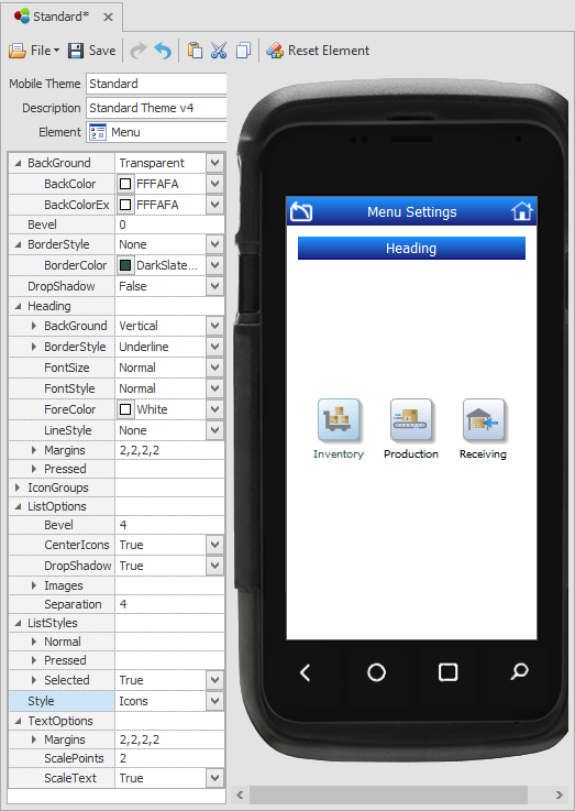
Themes: Menu

This sets the theme for application menus and submenus. Note that System Menus (Strip Menus) are different from application or function menus. To set System Menu (Strip Menu) see Environment.
BackGround - sets the background styles and colors for the menu form.
Bevel - sets the angle of the menu control's corners. The values range from 0 to 100, where 100 is curved.
BoarderStyle - sets the color and use of a drop shadow on the menu control's edges.
Heading - sets the default styles for the heading text and the heading bar in the menu control looks and how an object (i.e. icon button) appearance changes when the user presses it. The style properties are applied the same as for other controls. For details see graphical control properties.
Icon Groups - sets the color scheme for the selected Icon Group. The color is applied as a background to the icon(s) in a specific menu at runtime if it was set in the Menus and Roles > Menu name > Link Information > Icon Group. The icon group name can be changed from the Studio >Configuration > System List Management screen: Menu Icon Groups.
Icon Size – see this property under ListOptions > Images.
ListOptions - sets the icon styles. Bevel sets the corner angels of the icon. Center Icons if True centers the icons relative to the edges of the menu control. DropShadow adds a shadow to the icons. Images is where you set the icon image Size in pixels. The image Margins (left, right, top, bottom) sets the distance between the icon image inside the container and the edge of the image container. Separation is the how much space is used to separate each icon -- this value is affected by the image size and margin settings.
ListStyles - sets the appearance of the way the icons/menu objects are listed before they are selected and while selected (pressed). You can also prevent an icon from being selected by setting Selected to False (but True is the default).
Style – sets the appearance of the menu. The options are: Buttons, Column, Desktop, Image List, and Standard.
Buttons – displays the menu icons as large buttons with the name inside the button container.
ButtonList - display the icons in a list format; Each button has the name inside the container.
Icons – displays the menu icons in accordance to the spacing, margin and separation values set for the icons relative to the menu container. The names are set outside the icon container.
IconList – displays the menu icons in rows, with the menu items name outside the icon container.
Text – displays the just menu items’ name and no icons.
TextOptions - sets the values for the icon names. The Margin is the distance between text and the edge of the icon container. ScalePoints reduces the size of the text by the factor supplied. For example ScalePoint 0 or 1 sets the text default size; 2 makes the text 2 times smaller then the icon size. ScaleText, if set to True enables scaling of text; False prevents it from being scaled (reduced).